Michael Tushaus is a 5-time Emmy®-winning D.P./Editor/Director based in Las Vegas, and he shoots for several types of projects ranging from narrative and documentary features, to branded content and commercials, to music videos, product shoots and more. When we heard from Michael about his latest work released on Amazon Prime, we were more than intrigued to hear more about it. Without further ado, we will let Michael take us behind the scenes of this horror/psychological thriller in his own words.
Thank you again for inviting me back (last time was for my “Before You Go” music video for Rabid Young) to speak more about my experience as the Director of Photography for our latest feature film, Abigail Haunting, written and directed by my colleague, Kelly Schwarze, along with co-writer and producer Charisma Manulat. Being this was a very small budget indie film, I also took on the role unofficially as the colorist.
With that said, I take no credit as being a certified colorist, but coming in as the Cinematographer, I was very pleased to be able to personally, without a lot of headache, achieve the look I was going for in this film. Let’s dive in to what my process was, and what worked for me and what I would do different in the future.
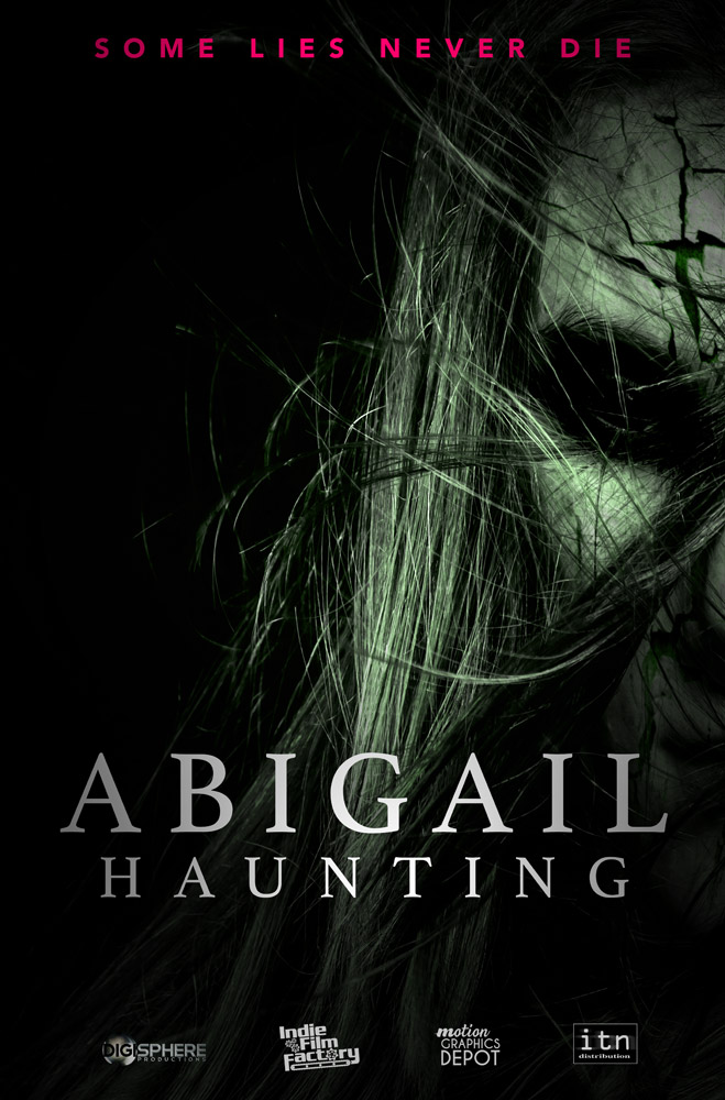
First off, Abigail Haunting is a horror/psychological thriller we recently released in the U.S. in March, 2020, on Amazon Prime and Tubi, with more distribution to come likely to Walmarts on DVD, a possible Redbox release, and several other modes of distribution currently internationally.
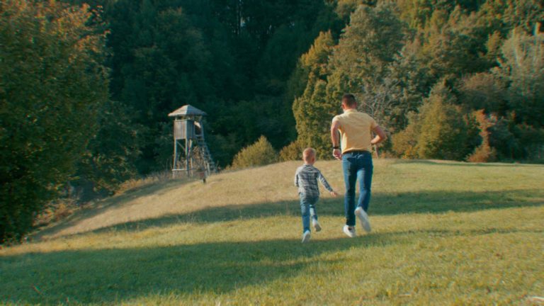
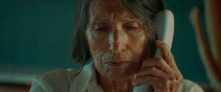
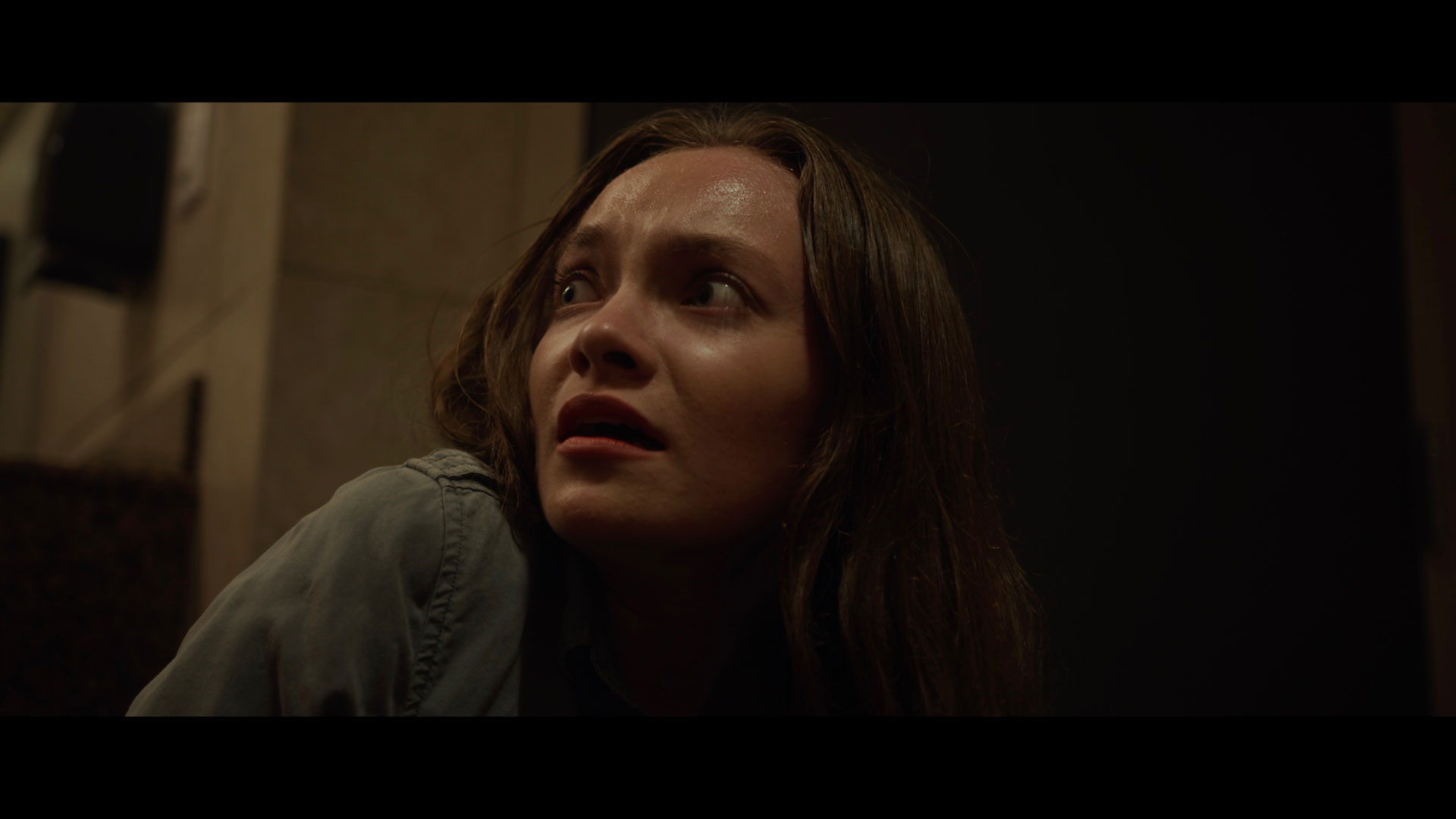
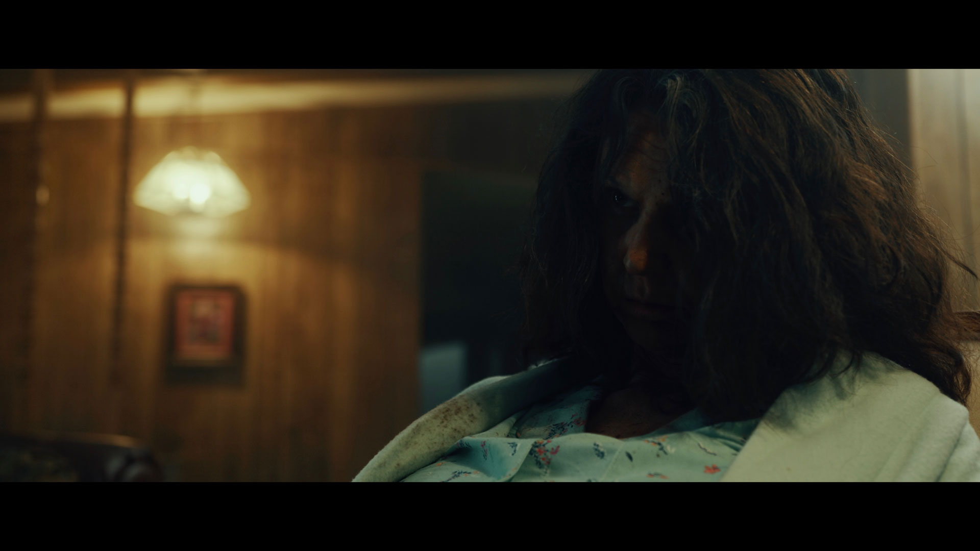
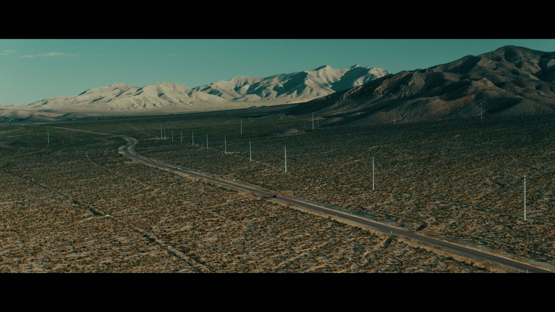
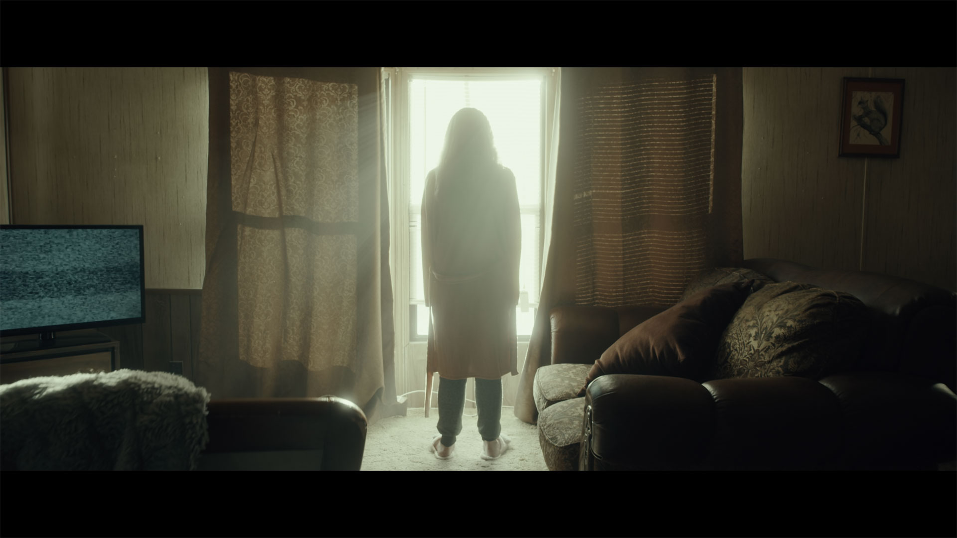
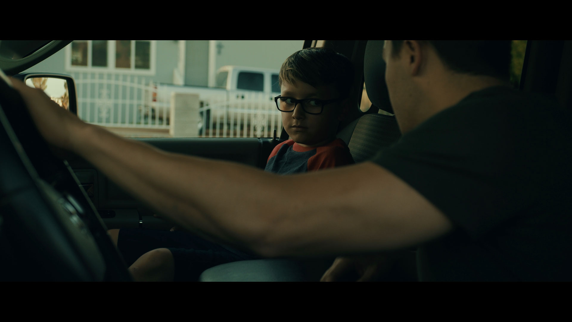
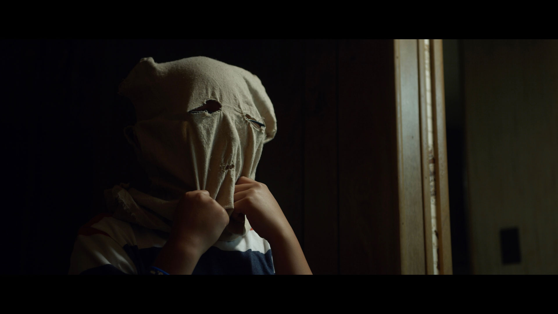
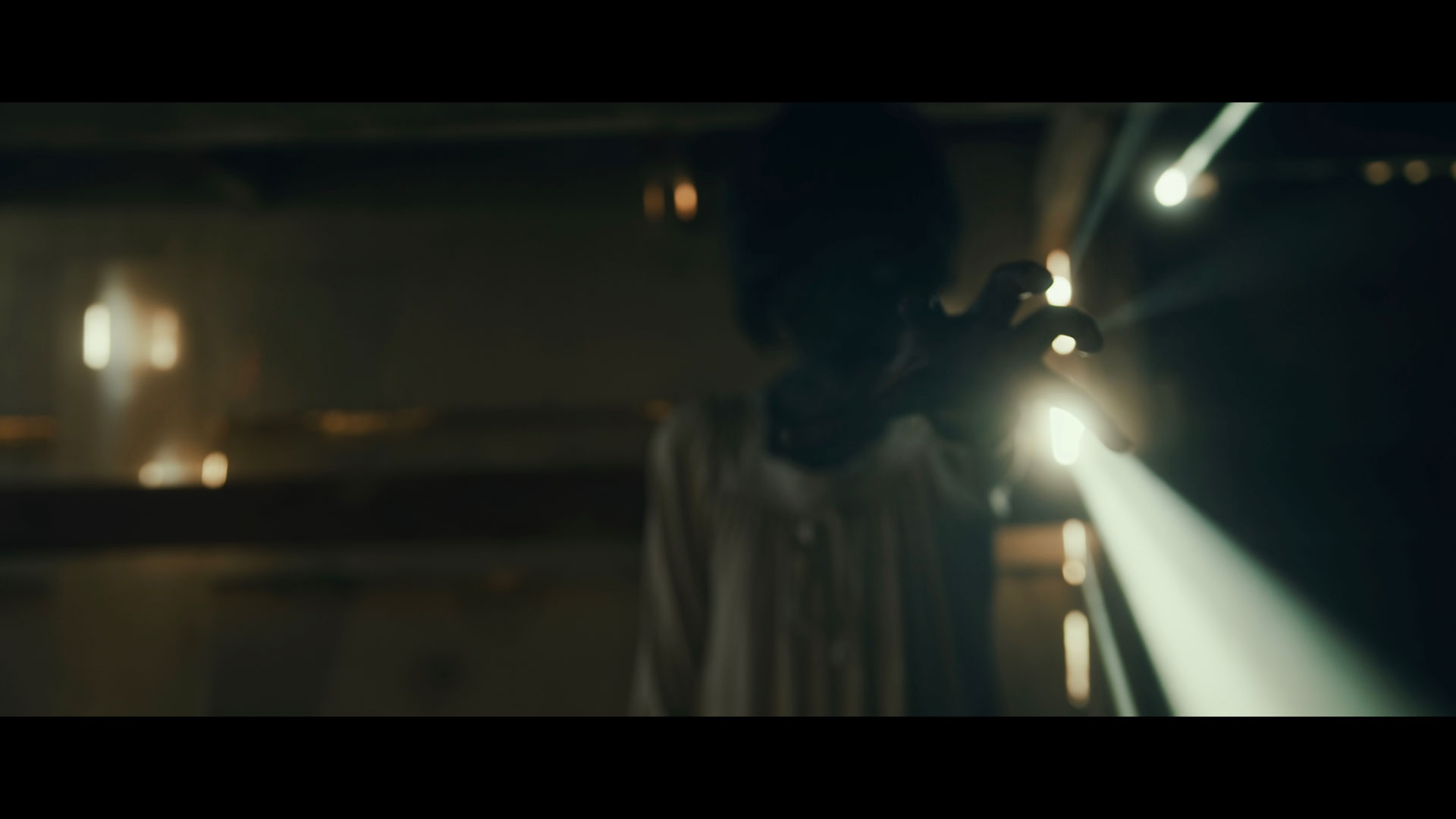
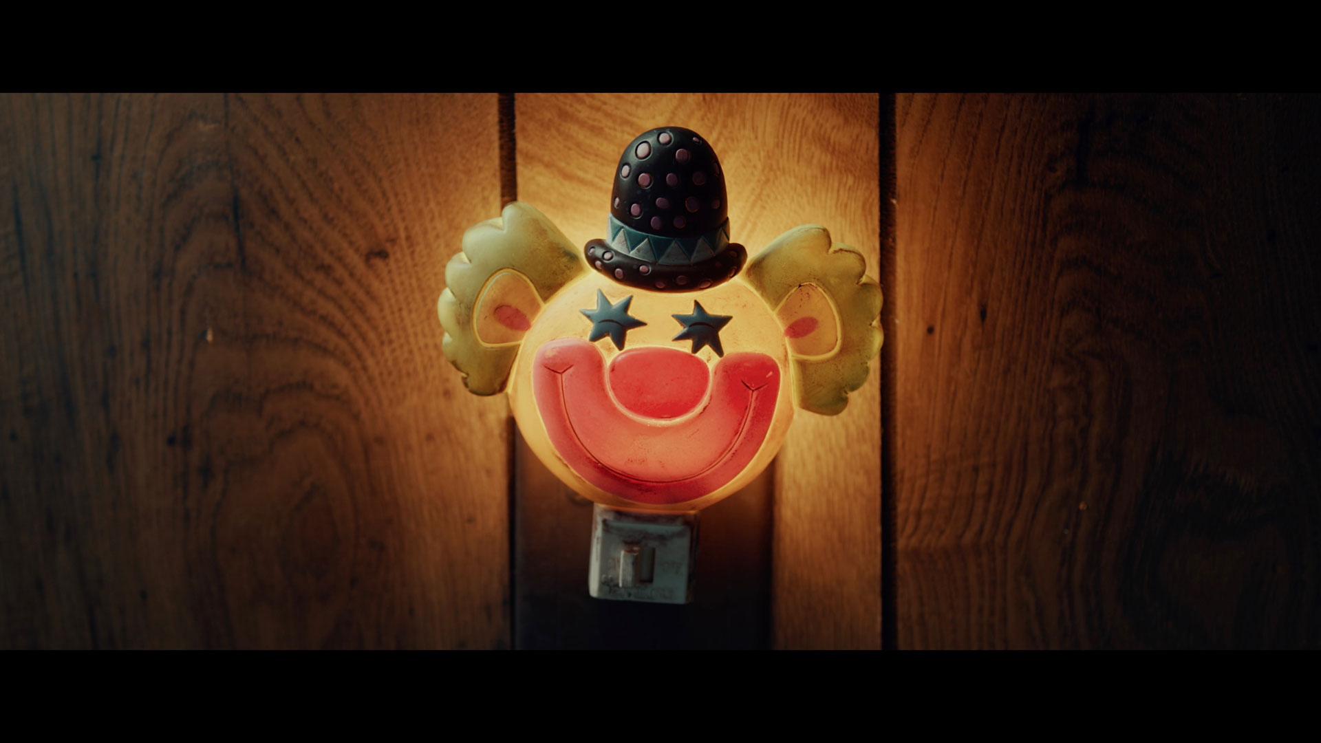
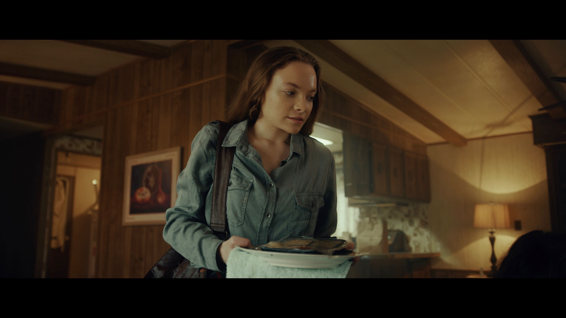
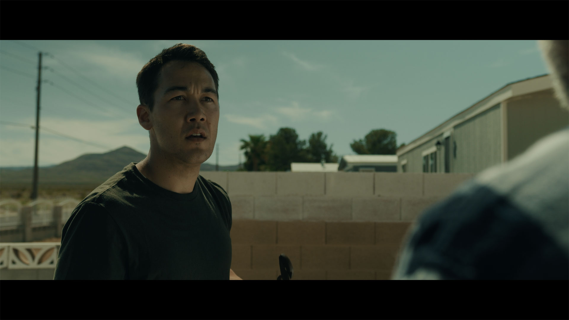
The film takes place in, of all places, a double-wide mobile home outside of Prescott, Arizona (though filmed here in Las Vegas, Nevada). Though an unlikely location for a horror film, the location lent itself well to the very creepy prospects of an older, crazed and catatonic woman, Marge, who formerly foster-cared the lead character, Katie, who has now fled back home in search of a place to lay low after a robbery with her boyfriend went horribly wrong.
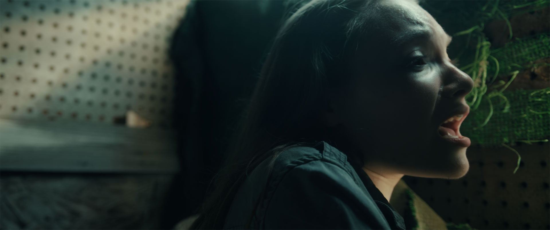
We discover Katie is not our typical busty heroin that you would automatically root for. In fact, she’s incredibly flawed. But, through a series of events, we discover just how messed up her childhood was, and how awful her foster mother really was. Mix that with a ghost of a teenager who has a vendetta against Marge, and a longing to connect with Katie for some reason, we find a story that is much more heartbreaking and dramatic than a typical “gotcha” and gimmicky type horror film. It’s a slower burn, and it takes some patience to soak in this psychological thriller.
Going into production, I knew I wanted to achieve a unique, yet identifiable look that would legitimise our cinematic efforts. It’s obviously hard for an indie filmmaker to stand out, and unless you achieve a look that convinces the audience that it’s above your run-of-the-mill “cheap” film, you lose them right away. Fortunately, based off our viewership numbers during our first few months of being up on Amazon Prime, we have concrete evidence that our viewer retention was extraordinarily high.
In fact, the film placed in the top 20 most popular films released on Prime Video amongst all titles released there in June 2020. This was quite the feat for a very low budget horror film released directly by its own filmmakers. I believe the look and feel of the film, in addition to the story and performances, really sold it to stand out as a legitimate film. Why was this the case? Let’s take a closer look.
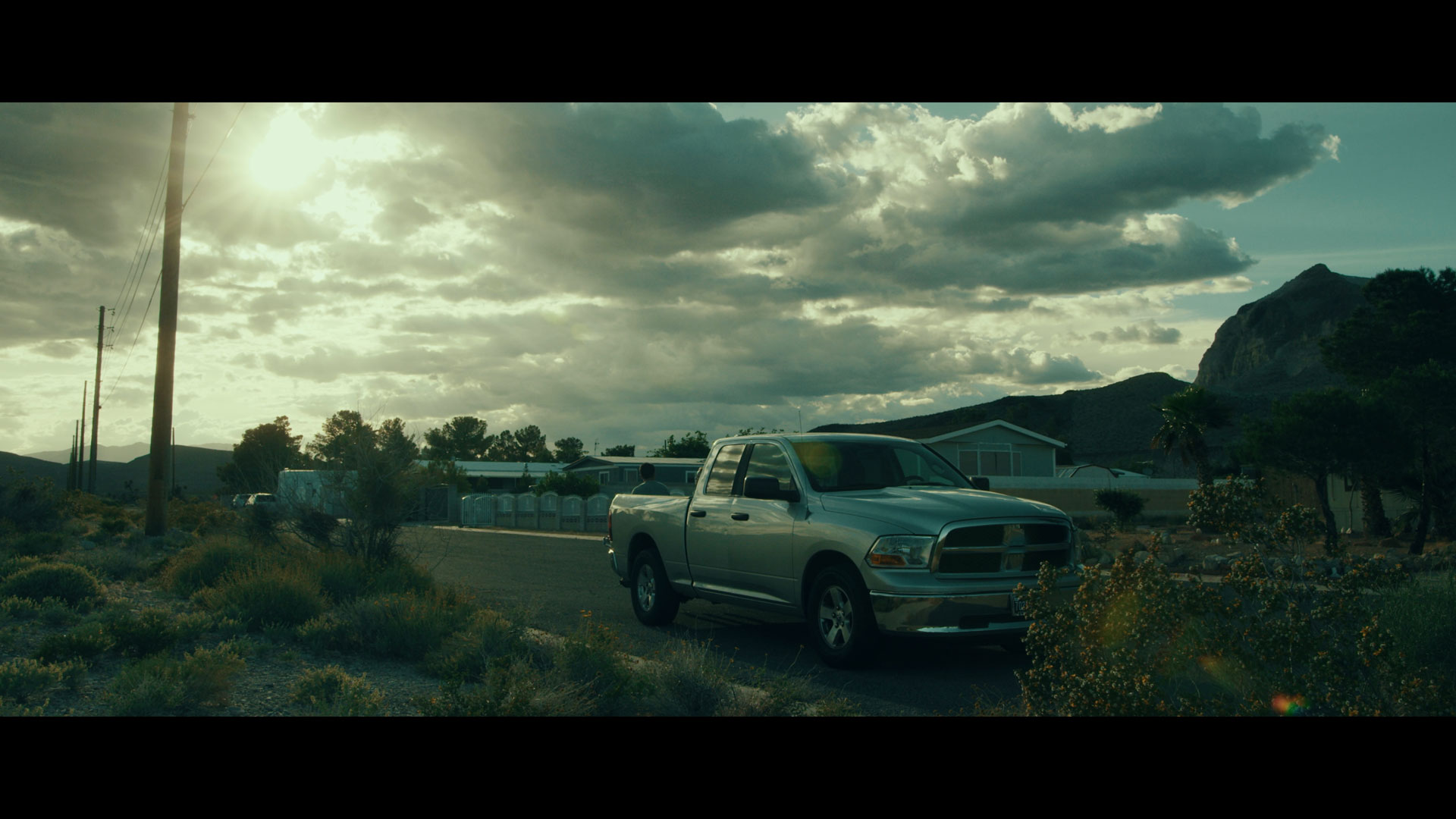
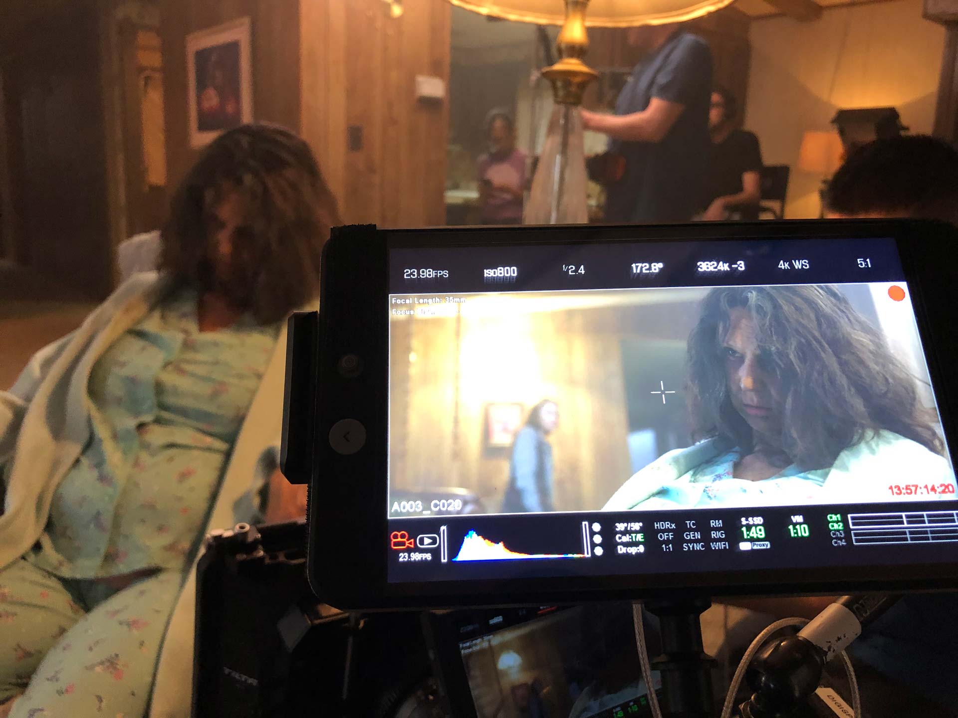
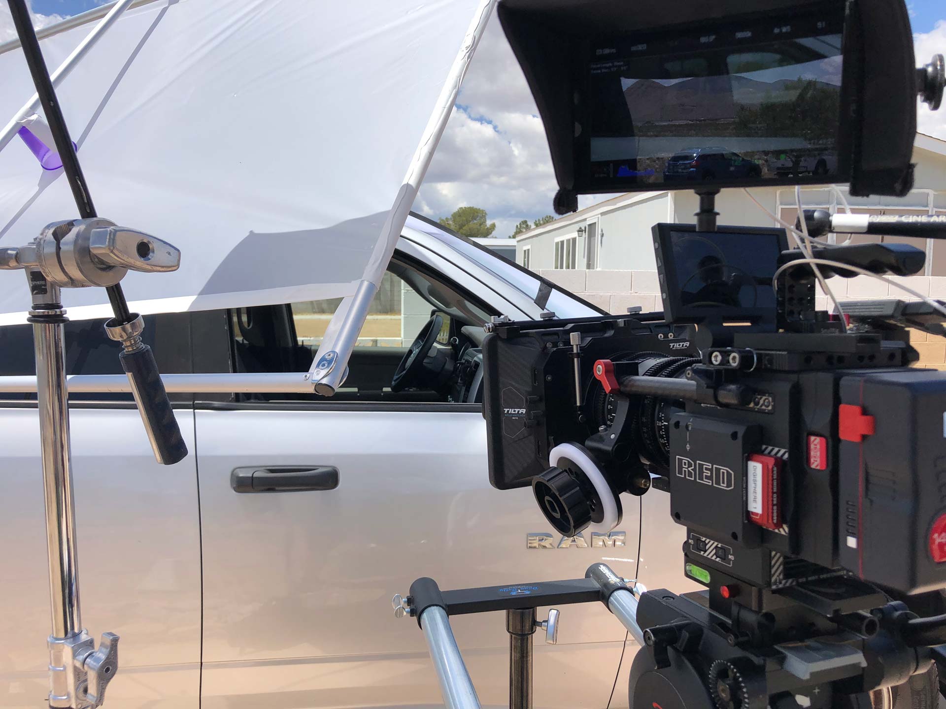
First off, I shot this film on my RED DSMC2 Gemini camera, and for a few scenes used my RED Raven as a B cam. I also utilized my Sigma Cine Zooms, 18-35mm and 50-100mm, for 95% of the shots. I also used my MoVi Pro Gimbal with Ready Rig to achieve all of the steadicam shots. Lighting-wise, I incorporated all LED, high CRI lighting, to achieve a nice soft look throughout. For a few scenes, I was able to utilize the Low Light ISO mode on the Gemini to really delve into the darker shadowy scenes and minimize the lighting to help keep the scenes dark and eerie.
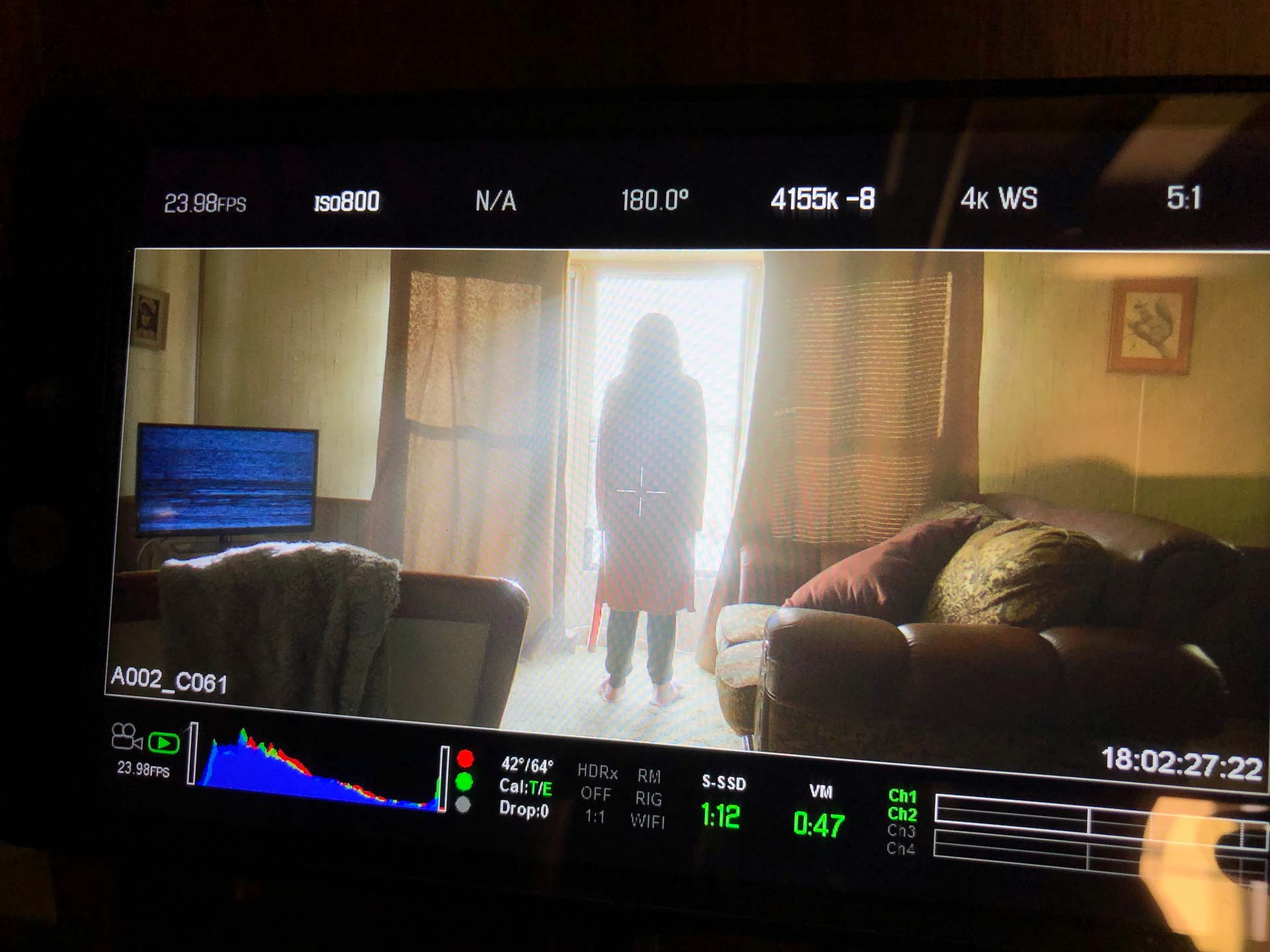
Because we knew we would deliver in 2.35:1 widescreen format, I actually set the camera to 2.35:1 as well, and didn’t allow myself to capture in a fuller screen format. I feel that, though it gave me less flexibility in post, that mindset really forced me to make sure what I got in camera was closer to the final product. Keep in mind, it has been the case for decades for filmmakers who captured their movies on film, and that they did not rely on being able to go in and go crazy in post with their framing and cropping. Most of the time, what was captured on film was the frame it was going to be. I feel this made me much more disciplined in what I was filming.
Once we got to post, I actually bypassed working in the IPP2 workflow. I’m sure most RED users will be scorned by this, and I’ll probably hear about it. But, I experimented around quite a bit and I ended up landing on working in the Rec. 2020 / BT. 1886 workflow which I felt translated the best when we would preview scenes on a standard 4K/HD television playing 1080p H.264 encoded files. I think this is an important step when previewing scenes and edits (after editing on a decent monitor-mine was on my iMac Pro), because ultimately the film is going to be encoded to h.264, and be compressed down to 1080p to be played on an average Joe’s television.
One can go buy an insanely great viewing monitor that is super accurate in color and shadows-such as the new Apple Pro monitors for the the Mac Pro, but no one out there is going to watch this film on one of those monitors. It’s gonna be a TV from somewhere like Best Buy or Amazon, and, it MIGHT have HDR if you’re lucky. I was in the mindset of an HD release through a highly compressed medium delivered on Prime or Tubi. So we continually rendered preview files in this medium. This also raised flags for a few scenes that had significant banding in compression, and I figured out workarounds to minimize the problem.
I used the Lutify.me LUTs in their standard Rec. 709 form, and not the LOG correcting format since Rec. 2020 / BT. 1886 was already a decently saturated and contrasted standard picture. Keep in mind also that for my B cam, the RED Raven, I kept those files in DragonColor2 / RedGamma4 because they were easier to match to the Gemini’s color than any other setting I tried. I was pretty happy with how much they appeared to match up.
Now, the LUTs I chose, after auditioning dozens from the Lutify.me library, were actually from the movie inspired looks library, specifically the Suicide Squad looks #1 and #3. After I made the correction pass, which in itself established a certain look I wanted to achieve, I really liked what these LUTs did on top of the corrections I made. And being that I am again, not a trained and certified colorist, I did something that was a bit of a cheat that helped quite a bit. For those who are not high-level colorists, here’s a good tip:
I studied a bunch of other films in the genre, and I collected some screen grabs from online that I really liked and felt were good inspirations to the look I wanted for each scene. So, I dropped those screen grabs over scenes in my timeline that had a similar composition. For example, I found scenes that took place in a living room, similar in look and color to the scenes we had and were also graded in a scheme I really liked-and they were scenes from very popular, modern horror films. I would lay the still over the timeline and reduce it to 25% in size. I could then directly compare what the “Hollywood” film was doing in color, shadows, tones and so forth, and then I would see how much I could emulate it-but still keep a sense of what I was wanting. In short, I warmed up the midtones a bit, cooled down the highlights a bit, and adjusted my luma curves. Then I auditioned the LUTs that helped achieve the final styling of the scene. This method proved to work really well for me. It helped me have a comparison I would otherwise never consider, or have at least a baseline to go from.
This was a technique that I think greatly helped me, since it bolstered my confidence in the look I was going for comparing it to a film that was accepted as a box office smash. Then, once I felt I was in the ballpark of the look I wanted, I continued to tweak to my own tastes to solidify it. I worked entirely in Final Cut Pro X, and used a mixture of the color tools including the Color Board, Wheels and Curves. Then, I simply used the Custom LUT tool to load the Suicide Squad inspired LUTs. I mixed them in at a variety of percentages-sometimes the scene looked best to have the LUT in at 100%, while other times, typically the darker scenes, I would only mix it to about 50%. This helped me to maintain detail in the shadows in those darker scenes.
If I could go back and do more, I would use DaVinci Resolve (I graded our last fan film, Wolverine: Lost Chapters in Resolve) and incorporate it into the coloring process better. I mainly did not because our release date got pushed two months ahead because of the pandemic, and we decided to release earlier to meet the streaming surge that it caused. So the workflow had to be sped up. And, I am glad we did as it surely performed better because of more people staying home and needing more content to watch. And all in all, I was very satisfied with the end results. It worked for this project and that’s all it needed to do.
I have graded several projects with Lutify.me LUTs, and I have to say they are my absolute favorites. I just get a much better cinematic palette out of these LUTs and they translate so well with RED Camera footage, which is most of what I shoot. Check out my website at www.digisphereproductions.com or go to my YouTube channel, http://www.youtube.com/c/DigisphereProductions, to see more of my work-much of it graded with Lutify.me LUTs.
Here’s a link to my current reel:
Abigail Haunting on Prime and Tubi:
https://tubitv.com/movies/538163/abigail_haunting