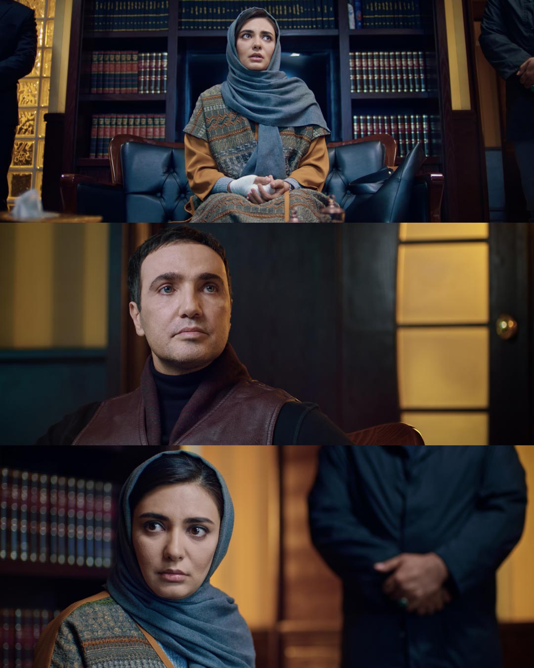
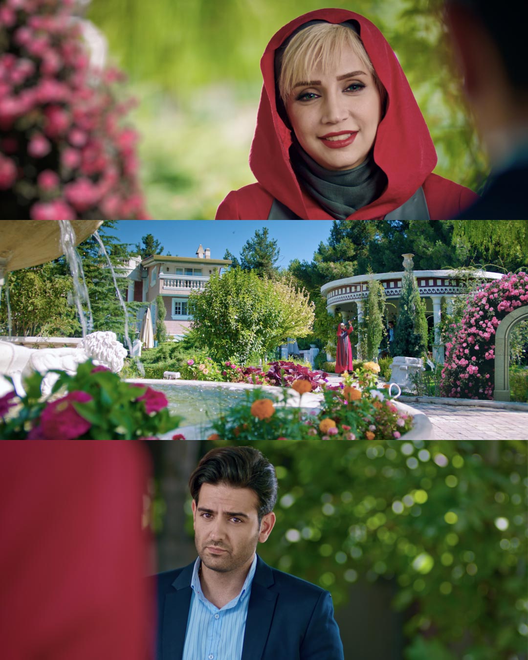
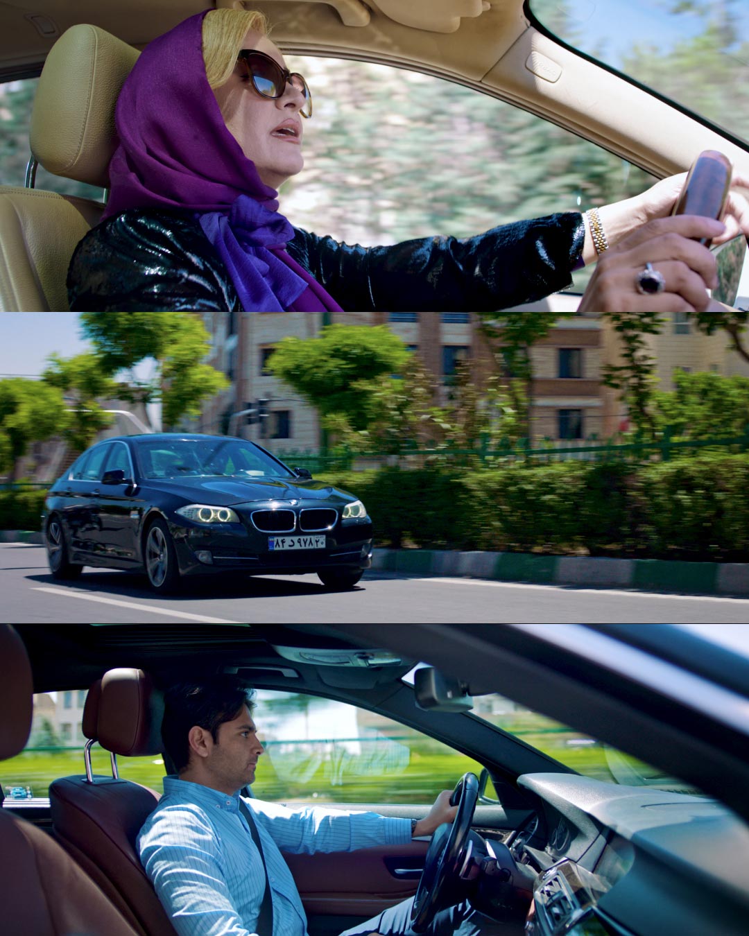
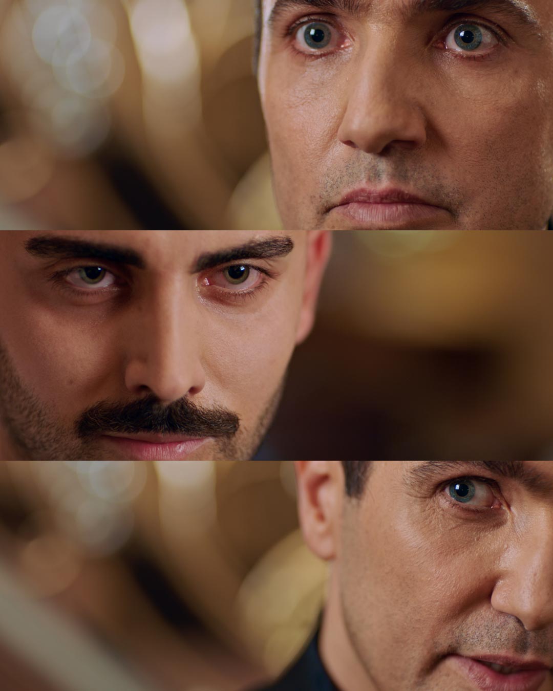
Amir Valikhani is a colorist and VFX creative director based out of Tehran, Iran. When Amir approached us and showed us some stills from the TV show ‘Mannequin’ he recently graded we immediately offered to showcase it in our blog. We love seeing how our clients use our LUTs to make their workflows faster, easier and more efficient and therefore we were intrigued to learn how Amir created the bold looks for the TV show directed by Hosein Soheilizadeh and beautifully lensed by Reza Sheybani.
Seeing how one utilises a tool in their workflow is always refreshing, as you always learn new stuff, so let’s dive straight in and see how Amir Approached the grade.
Did you have a particular look in mind before you approached the grade?
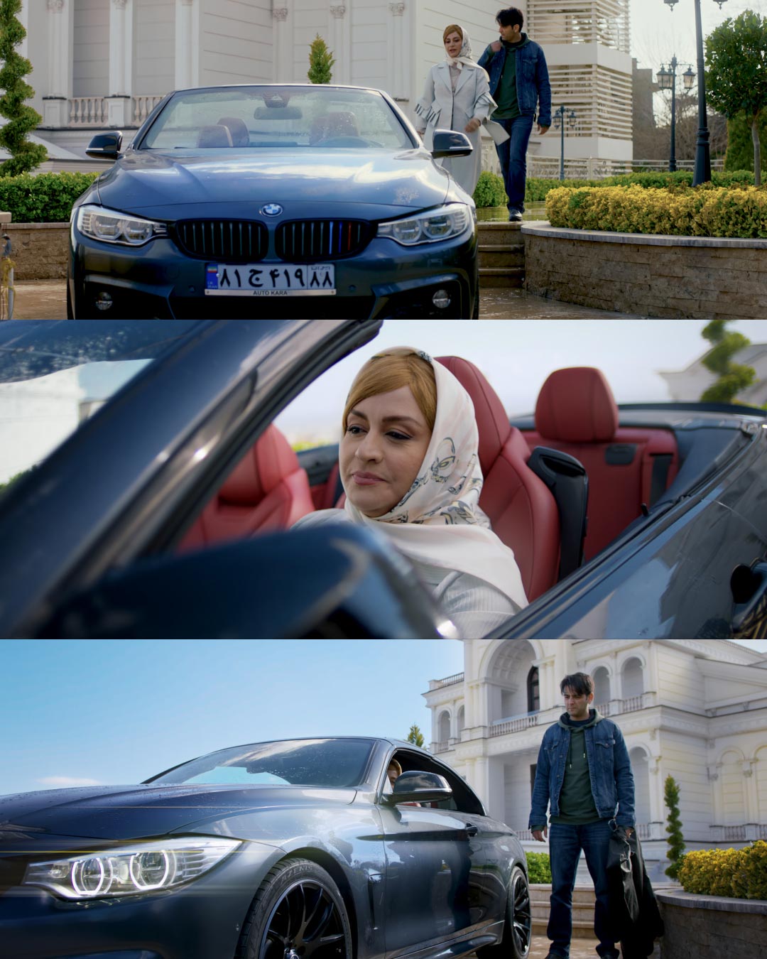
Yes. From the very beginning of pre-production we discussed the look that we want to have for the show. The show is all about models and their life-style. It’s all about showing off and being the center of attention so we knew we wanted to work with high-key, vivid colors.
What does it mean in practical terms for you as a colorist?
That means pushing the saturation to the max while making sure you don’t go over the top and still keep the skin tones realistic. It also means using parallel nodes in DaVinci Resolve as they really allow you to better mix the different changes that you apply to your image. When you are pushing the saturation it’s very easy to go over the top. Parallel nodes mix and blend the changes nicely so the overall look is very saturated but still feels somewhat natural.
How hard was it to achieve the look you were after?
It was easy for two reason. One, we discussed the look we want during pre-production so we always knew what to aim for and second, the DP Reza Sheybani made the life easier for me. To get that flashy, sharp look he opted to use Arri’s Ultra Prime lenses and adjusted the lighting accordingly.
We’ll get to the lighting a bit later, but for now, please tell me how do LUTs take place in your workflow?
Once I’ve established the basic look and I have color corrected image, I’ll use the LUTs with my other corrections to stylise the image. For this show we used many different LUTs from Lutify.me Professional Package, depending on the mood of the scene. The use of LUTs really got us “there” really quickly and allowed us to move faster all the while exploring different creative decisions or paths we could take for a particular scene.
Can you elaborate a bit more on the process of creating the grade?
After we knew which kind of look we wanted for a particular scene the grade was done in 3 steps. First we converted from Arri’s wide gamut and Log-C into Rec709. You could do this using LUTs or you could use color transform in DaVinci Resolve. During this first step I’ll also make some primary corrections like white balance, exposure, contrast, etc. For example, if I know that I’ll be using a teal and orange LUT, I might increase the white balance slightly.
Second step was the creative part of creating the look. This is where I’ll use LUTs and make my own other corrections to establish the stylised image we were after. Usually I’ll make my corrections in parallel nodes. You see when you use a parallel node it mixes the result of the node that you’re working on with the result of the previous node instead of just adding the result to the node before. That way, you can push the controls more while maintaining a more natural balance between different changes and settings. During this step I’ll also use any power windows or color picker to select particular areas and enhance them. Again, parallel nodes help i this process tremendously.
Third step, was matching the different shots together and adding some special effects. You see I find it easier to match the shots once I’ve established the creative look. Some colorists prefer to match first. There’s no right or wrong. You can do both and it really depends on the workflow. But no matter what, after you’ve established the creative look you will have to make some final adjustments to better match the different shots. Also, during this step I added any special effects such as glow, lens reflection or keyed actor’s faces and enhanced them slightly.
Thank you. Let’s get back to the lighting part. This question would be best suited for Reza. Reza, can you please tell us a bit more about the lighting?
Sure. I used Sky 60 and Sky 180 at eye level and for stage lighting. Arri 4000 HMI and 2500 HMI daylight were used as well. We opted for daylight balanced lighting so we could get higher color saturation.
What other techniques did you use to achieve the look of the show?
We shot everything wide open at ISO 160, even in daytime and exterior sets as well as the night sequences. This really helps pull the focus on actor’s faces and expressions. I used Ari Ultra Primes for that sharp, clean look and decided on using wide lenses as much as possible to amplify the picture.
Thanks. Back to you Amir, could you share a grade tree with us?
Sure. Here’s a sample grade tree which shows the color grading process.
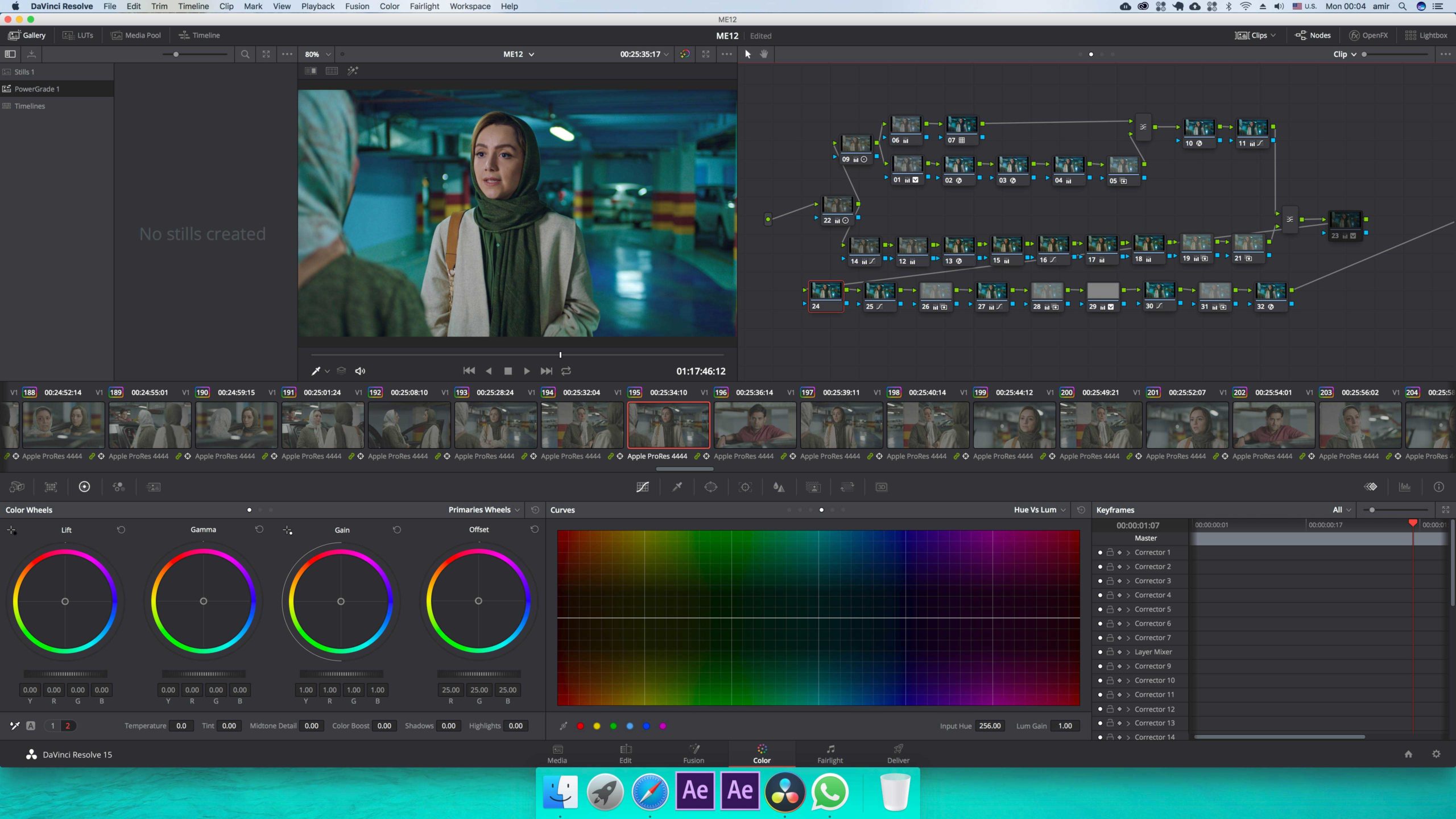
Could you explain to us what’s going on in the tree?
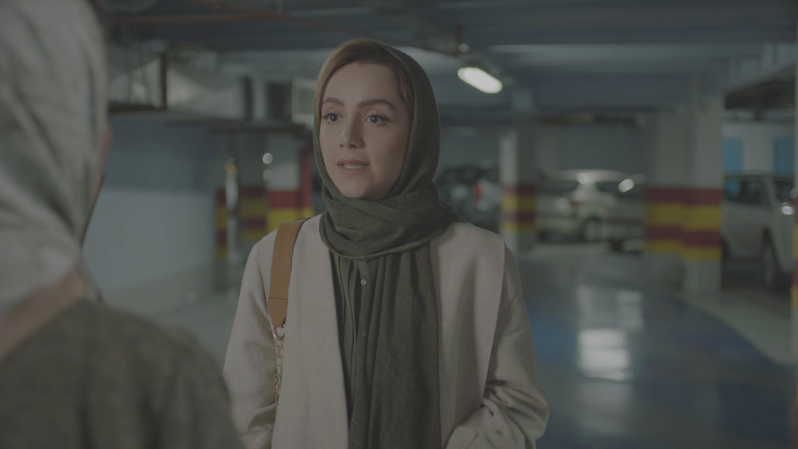
Yes of course. So we first start with a log image.
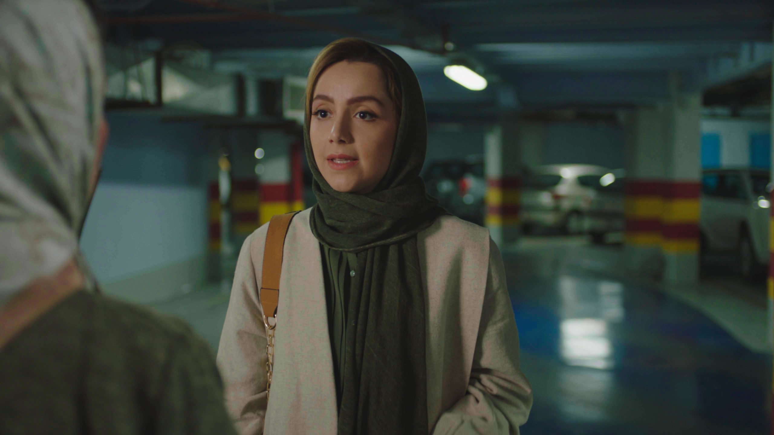
Then, we first convert into Rec709 to get something like this.
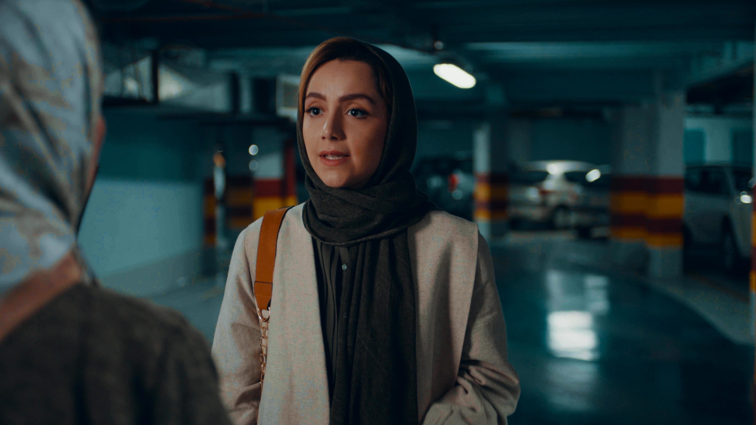
From here, I split my edits to parallel nodes for reasons explained above and start creating the look of the scene. For this scene, I based my look off of the freely available Hilutite LUT from Lutify.me. Here’s the Hilutite LUT without any other changes.
After I was done with the grade I came up with the look that you see in the grade tree.
Thank you so much for your time Amir. We can’t wait to see more of your awesome work.